Share this:
Return Flight MEL > CHR
15 July 2018 Comment
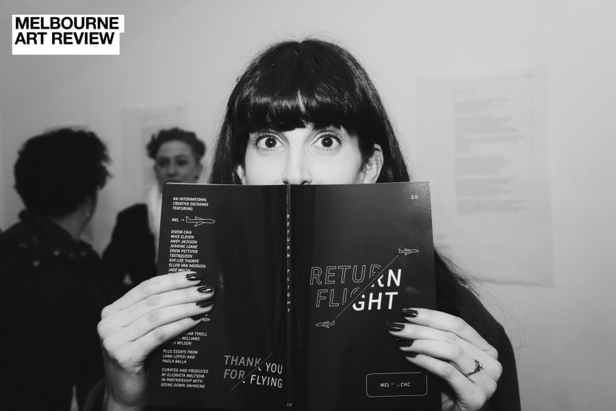
Return Flight MEL>CHC is the second chapter of a three year project spearheaded by artist and curator Elizaveta Maltseva. In 2017 it launched with MEL>EDI, showcasing 20 contributors from Melbourne and Edinburgh with an exhibition in both cities and a publication using the concept of “place” as a starting point. In 2018 Return Flight explored the topic of “home” with artists and writers from Melbourne and Christchurch, New Zealand.
Featuring the work of Drew Pettifer, Jade Walsh, TextaQueen, Mike Eleven, Khi-Lee Thorpe, Inge Flinte, Cameron May, Pati Solomona Tyrell, Nancy Wilson, Miriama Grace-Smith, Jake Arthur, Hamish Clayton, Selina Tusitala Marsh, Tayi Ashley Tibble, Matariki Williams, Sean M Whelan, Andy Jackson, Jeanine Leane, Didem Caia and Ellen van Neerven.
I was lucky enough to be an artist included in the 2017 inaugural Return Flight project, which saw an exhibition at Federation Square Atrium, and The Number Shop Gallery and Studios in Edinburgh as well as a printed publication through Going Down Swinging. The experience was both extremely personally and professionally rewarding. Having the experience of exhibiting at Fed Square and internationally, and the new experience of using an external theme (the word “place”) to help go back into my practice and create a new work that both brought closure, responded to the stimulus and provided inspiration to another creator (writer and poet Harry Giles) was incredible.
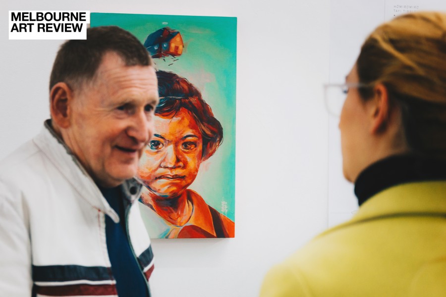
This year, the format of RF is the same, with a similar word used as the launching point for the artists. The word “home” (in the same vein of “place”) helped visual artists create video, photography, paintings, paste-ups and illustrative works to inspire a cohort of writers to respond to. Writers are not given any info on the artwork that is paired with them other than an image. The format guidelines are solid and constructive, if not a bit rigid, but you know what they say; if it’s not broke don’t fix it. I, personally, would love to see the format for the final RF next year shaken up a bit and experimented with. In the current guidelines we are merely seeing new work by new artists, but how do we really respond to these themes of location, home, place, distance? What elements could be changed, broken, replaced within the RF structure to allow artists and writers to really take us, the patron, the reader, the viewer to their authentic and autonomous understand of where they sit in the world? Given, the initial stimulus, the word, is open ended enough.
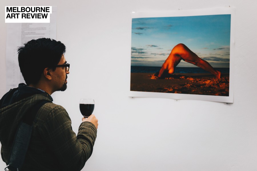
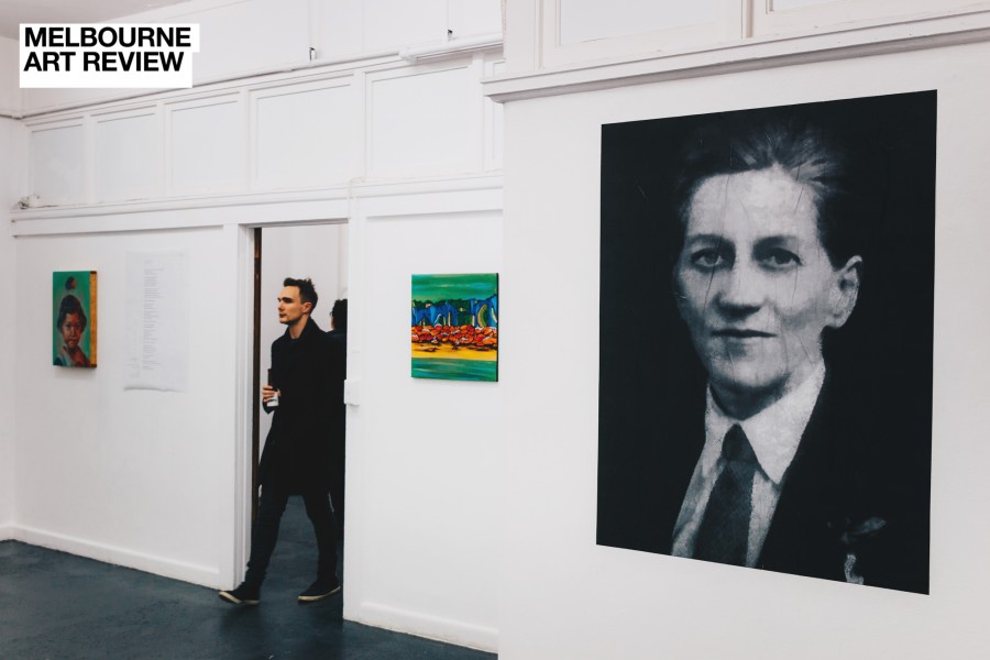
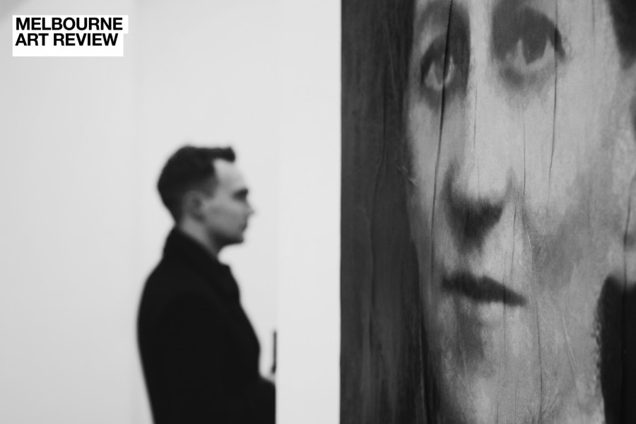
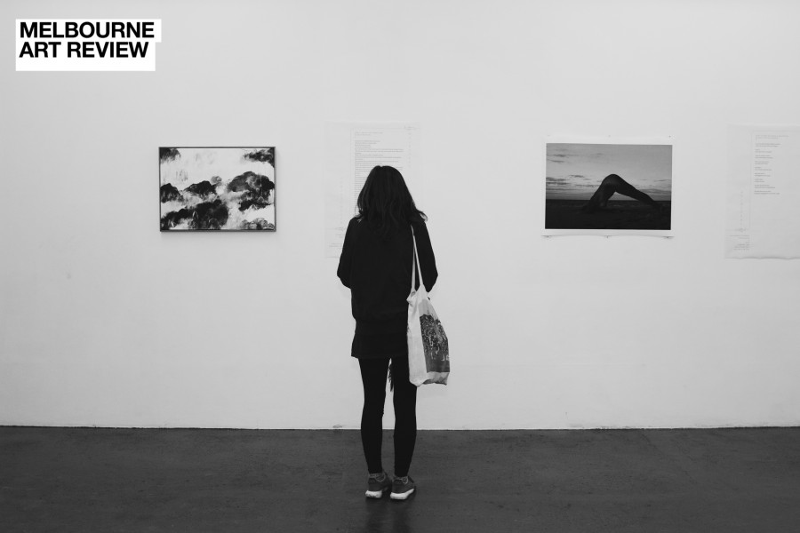
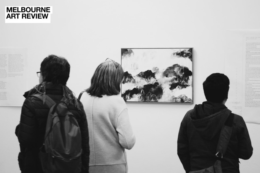
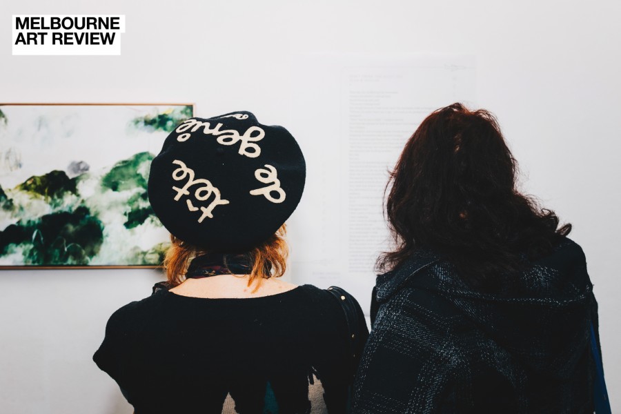
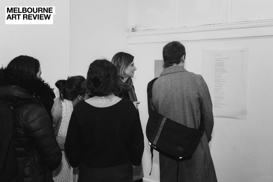
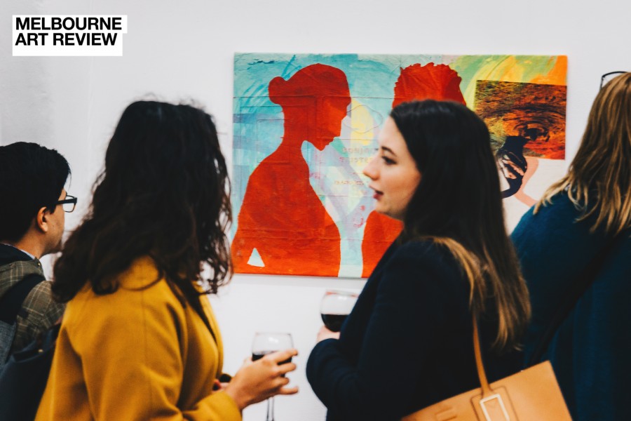
As a project RF is ambitious. Bringing multiple artists across space and distance, careers, mediums, ages and ethnicities together is applaudable and impressive. As a group exhibition we are probably seeing one of the tightest, diverse and more interesting; with the wall-mounted writing complimenting the assigned artwork used as stimulus to keep us engaged and interested. The use of creative writing as a substitute from the often dry, “art-wank” artist statements takes control away from the artists and muddies the waters of interpretation and reading further. I find this both exciting anti-establishment curatorial act equal parts frustrating and punk. Inside the work, last year, I was empowered to make a work that was provocative and didactic, a piece that, to me and my reading, was unable to be misconstrued. How very wrong I was when I had Giles respond. As a patron this year, I can see that not only are we bringing our own knowledge, understanding, social and historical framework and material readings to the artworks when we view them, but now we are also placing the work within the world created by the accompanying writing, which, is often parallel to the artwork (conceptually and physically in the space).
It’s an interesting way to break down the didactic use of writing and artwork we have become accustomed to.
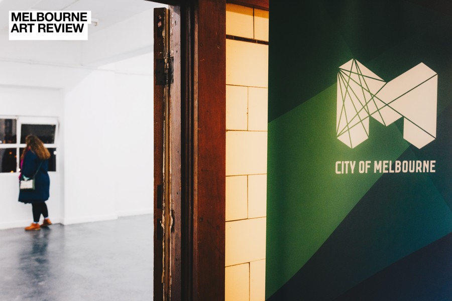
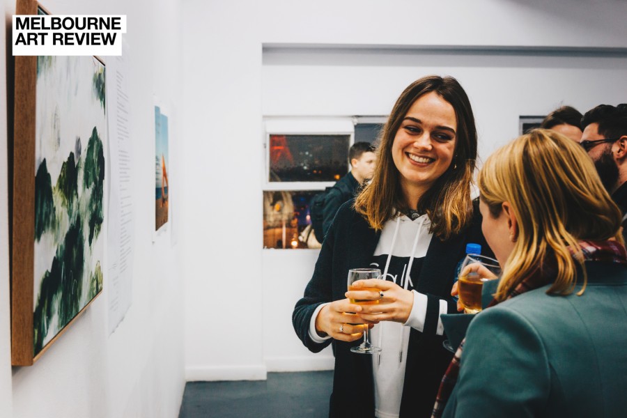
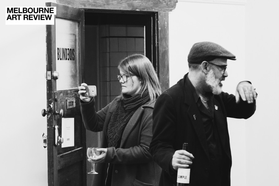
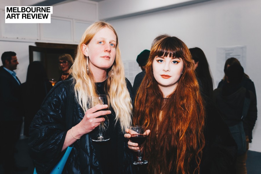
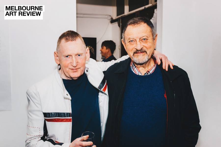
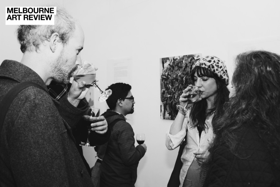
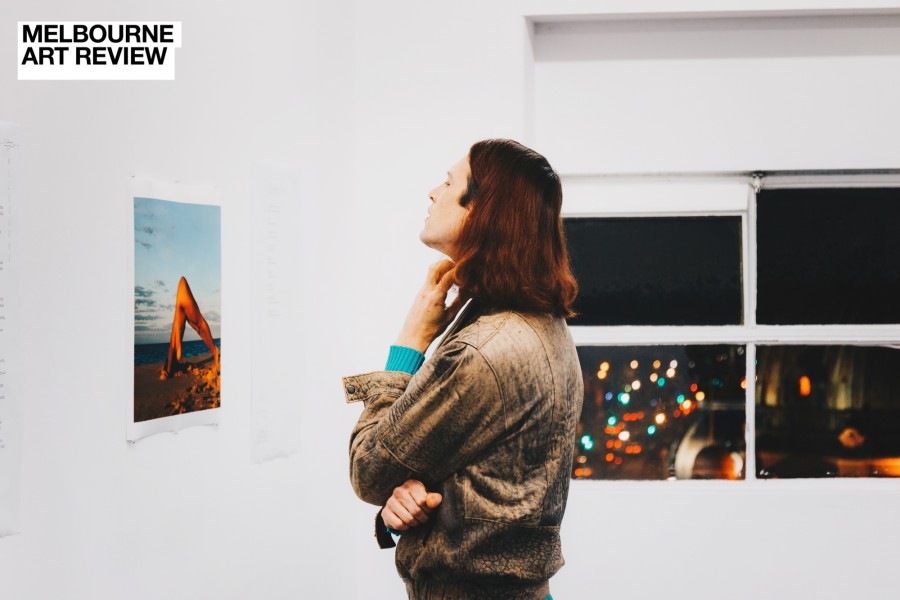
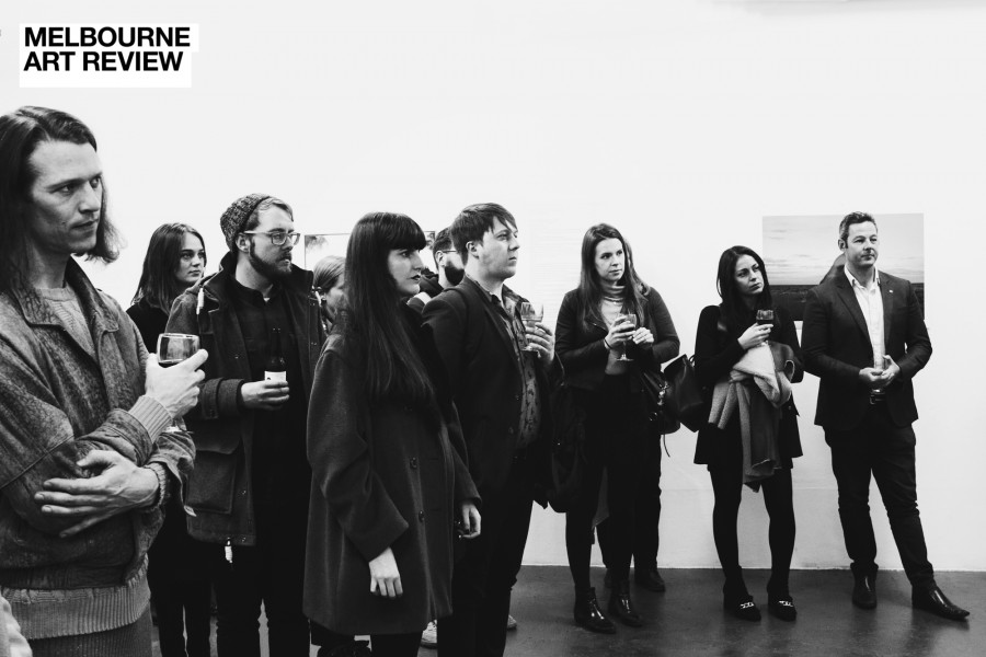
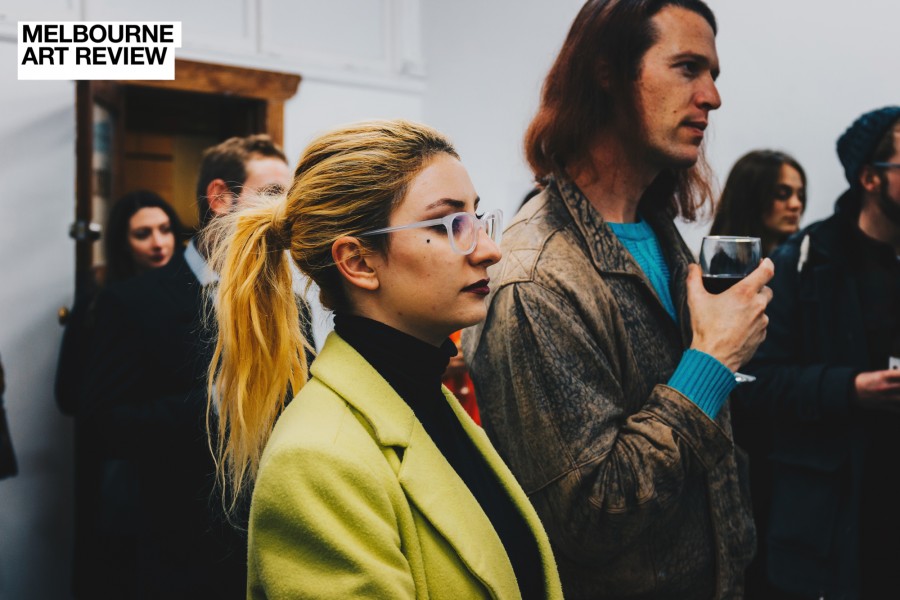
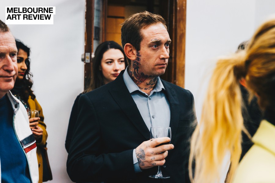
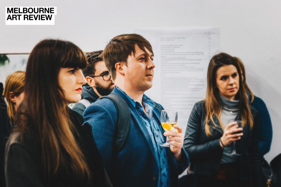
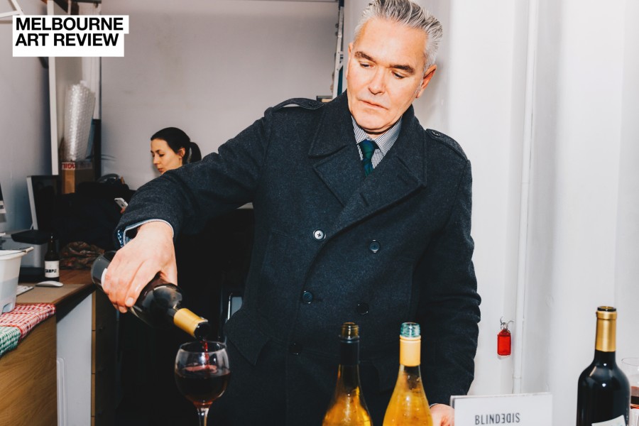
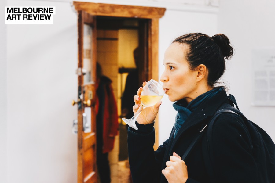
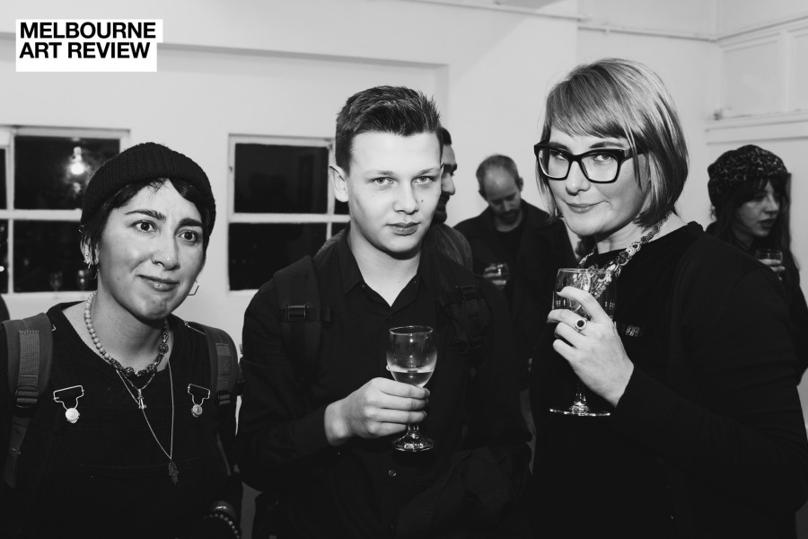
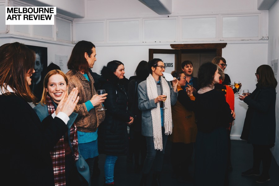
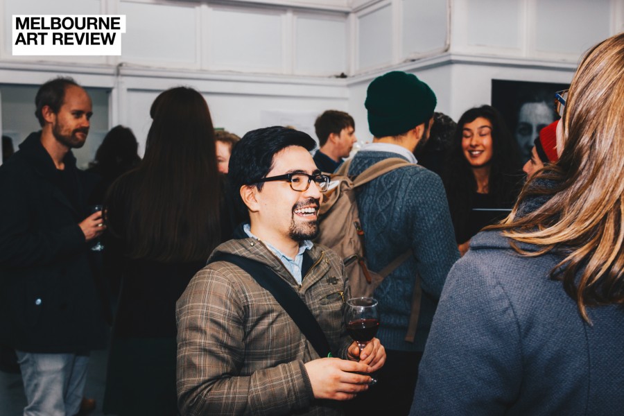
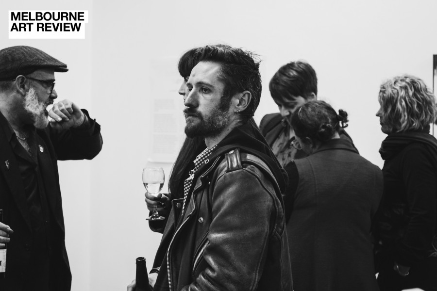
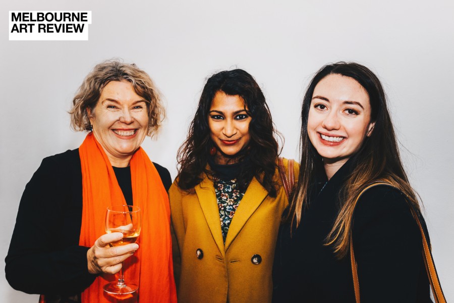
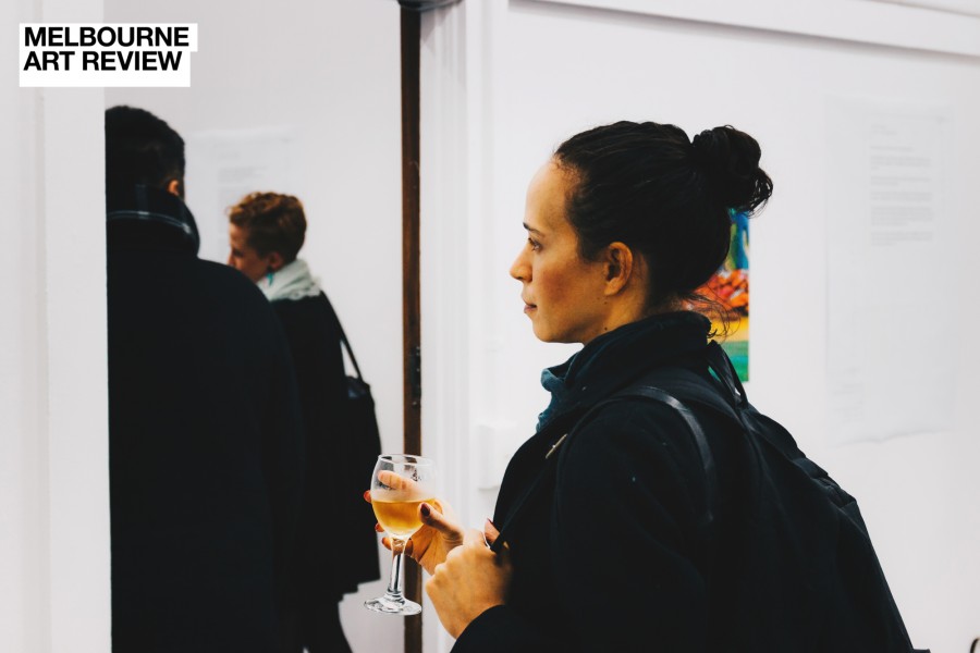
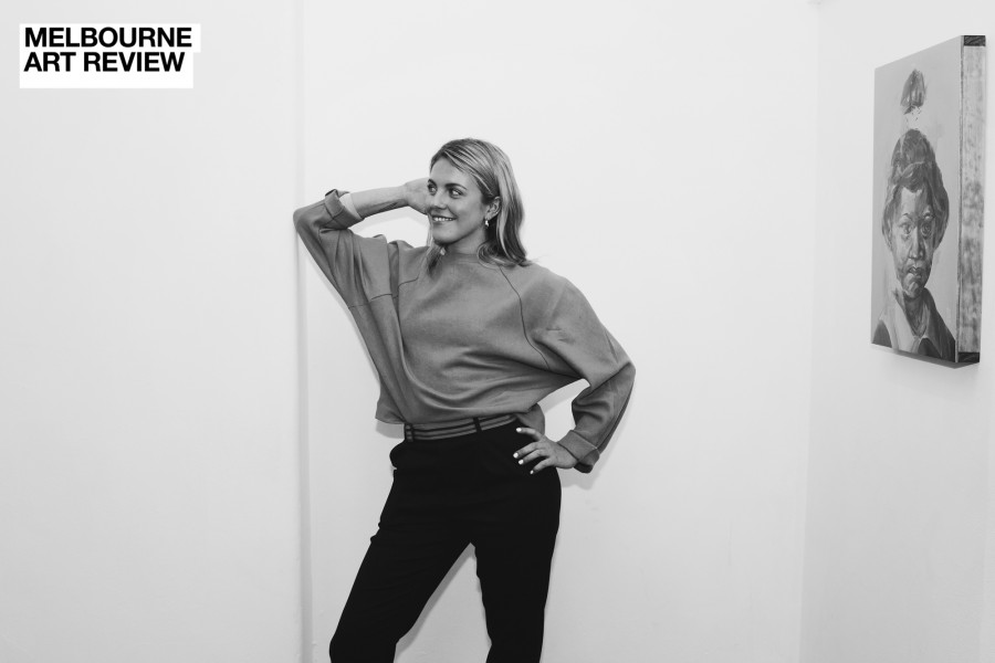
The Melbourne launch this year was at BLNDSIDE ARI - a beautiful space in the Nicholas building in the CBD overlooking Flinders St Station. Comprised of two versatile, clean, large gallery spaces, BLINDSIDE is always a treat to visit. Friendly staff and a program that continuously delivers exciting and experimental contemporary work, you must check them out.
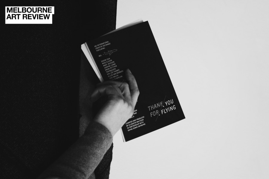
RF MEL > CHC is on now and you can also purchase a publication that accompanies the exhibition at BLINDSIDE.
I’m excited to see how the project develops for the final year in 2019.
